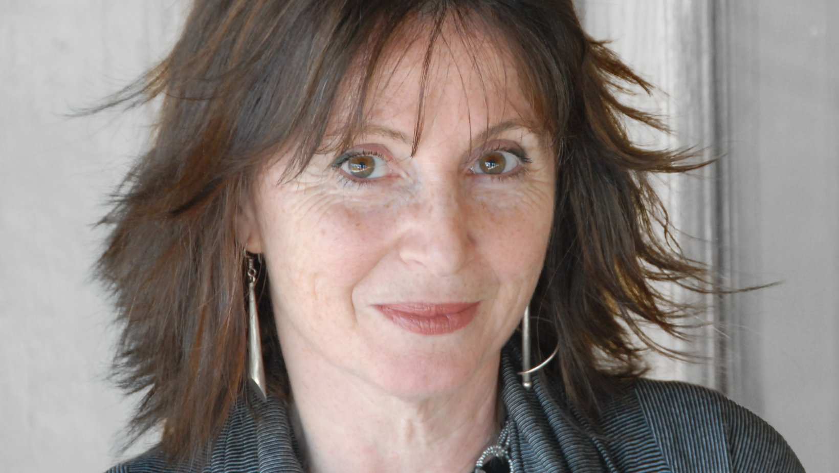
Ruth Kedar, the Brazilian designer responsible for the original Google logo, is a notable figure at the intersection of art, design and technology. Born in Campinas in 1955, Kedar emigrated to Israel as a teenager before moving to the United States, where her career took an unexpected turn. With a degree in Architecture from the Israel Institute of Technology and a master’s degree in Fine Arts from Stanford University, she explored the frontiers of graphic design, culminating in a project that would change her life and the visual identity of one of the largest technology companies in the world.
During her studies at Stanford, Kedar pioneered the use of emerging technologies, which led to her being hired by Adobe Systems. Her work on Adobe Deck, a promotional deck for Adobe Illustrator, stood out for the software’s innovation and adaptability, helping to overcome designers’ initial skepticism about the loss of originality in their works. This project not only established his name in the field of graphic design but also paved the way for future endeavors.
In the late 1990s, while teaching at Stanford University, Kedar was approached by Larry Page and Sergey Brin, who at the time were in the process of founding Google. They needed a logo that conveyed the company’s unique and creative vision, setting them apart from other search engines. With a design that combined simplicity with a touch of fun, Kedar not only met this demand, but also created a cultural icon that remains relevant in the digital age.
Ruth, you moved to Israel on the eve of your 16th birthday. How did this move impact your life and career in design?
My 16th birthday plans took a dramatic detour when my father’s prestigious job offer from the Tel Aviv University landed on the table. Leaving friends, family, everything familiar, and my dreams behind wasn’t exactly on my agenda. (to say the least!) A new language with an unfamiliar alphabet, a culture filled with customs I didn’t understand – it all felt like a major disaster, and worse I had no control over it.
But upon arrival, I had a choice: cling to the familiar Brazilian expat community, or dive into the new culture. I chose the latter, prioritizing mastering Hebrew, which I believed was the key to expressing myself and chasing my dreams.
However, navigating high school without any previous knowledge of Hebrew wasn’t easy and fluency didn’t happen overnight. Feeling isolated, I began rereading some of my favorite books in their original languages – Spanish, French, and English. While I wasn’t fluent in any of them either, the familiar storylines and alphabet provided a foundation for understanding. Each language felt like a new lens, revealing fascinating ways of manifesting ideas.
Surprisingly, this practice not only boosted my fluency in these languages but also unexpectedly accelerated my Hebrew learning. And fueled by a burning desire to achieve my goals and sheer determination, I was able to graduate high school and secure a coveted spot in the prestigious Technion’s Architecture Program.
I never expected that living in a new culture would open my eyes to a new perspective on life, modes of expression, and ways to move in the world, and that this experience would transform me into a keen observer, fostering a deep curiosity about everything around me. It challenged me to embrace openness and break free from limited thinking patterns.
Those initial struggles, in hindsight, became invaluable steppingstones. The ability to “listen” with all my senses, the openness to new experiences – these are assets that I acquired along the way and continue to enrich and inform both my personal and professional life.
Despite spending much of your life outside of Brazil, you were born in Campinas, São Paulo, and ended up achieving great success in the United States. What are your main tips for young people who also dream of building a career and having a future abroad?
I learned that building a life abroad transcends mere language fluency. It’s about diving headfirst into the heart of a new culture – understanding its people, their unique ways of thinking, and the unspoken rhythms of interaction. It’s about learning to navigate a whole new world without losing sight of your own roots or sacrificing your identity. Be open and curious to what the new culture offers, embrace the inevitable adjustments, and most importantly build relationships. Social integration is critical in a new environment.
As for building a career, there are many options, but if you are able and willing to invest long term, consider enrolling in a school program. Regardless of where you are in your career, there’s always fertile ground for growth. Whether it’s within your field, exploring related areas, or even a complete leap in a new direction, school life offers a unique environment. It’s a chance to deepen your knowledge, immerse yourself in your chosen field, and expand your skillset and expertise. It’s also a launchpad for building your network – connecting with like-minded individuals who share your passions and aspirations. And as a bonus, you can use this time to reassess your career path and explore unforeseen paths.
Remember, this is not a magic formula for guaranteed career success. However, it is a surefire path to personal growth, enriching experiences, and a life overflowing with potential.
At Technion, you graduated in Architecture. What motivated your transition from architecture to graphic design?
While my Technion education centered on architecture, I found myself increasingly drawn to the world of design, particularly the emerging field of architectural graphics. Unlike today, concepts of user experience were not a part of any curriculum. Architects certainly aimed for usable spaces, but accessibility for public buildings often fell short. Imagine navigating an airport, mall, or hospital without clear signage to restrooms, departure gates, or doctor’s offices.
This lack of focus ignited a passion within me. Inspired by a Graphics Press book on architectural graphics (“Archigraphia”), I envisioned creating visual languages that translated architectural plans into truly usable spaces. Upon graduation, I approached both architectural and graphic design firms in Israel, eager to bridge the gap between the two disciplines. Unfortunately, my vision wasn’t readily understood at the time.
Disappointed but undeterred, I secured a meeting with a major private contractor known for developing large-scale public projects. Armed with sheer passion and my copy of Archigraphia, I convinced him to take a chance on me despite my lack of experience. This resulted in a pilot project that became the springboard for launching my own studio – Total Design (the name being perhaps a touch presumptuous in retrospect!).
For the next five years, I honed my skills, creating architectural graphic systems for a diverse range of projects – airports, malls, convention centers and large residential developments. Being self-taught and driven by intuition, I increasingly craved a formal design education. This realization led me to pursue a master’s degree in design.
The unique interdisciplinary nature of Stanford’s joint program between Art and Engineering departments particularly appealed to me. It offered the perfect environment to delve into design holistically, embracing both aesthetic and utilitarian principles to solve complex problems.
Your master’s project at Stanford involved creating a deck of cards. Can you tell us more about this experience and how it influenced your career?
Playing cards have always captivated me. They’re a single product with a million uses, enjoyed by people of all ages and backgrounds. Imagine a game around the kitchen table, a high-stakes poker night, or even a fortune-telling session with a deck of cards – the possibilities are endless!
This fascination, coupled with the unique opportunity to dedicate an entire year to a single topic, fueled my deep dive into the rich history and evolution of playing card design across cultures. It was an enriching experience, pushing me to explore and experiment with multiple design concepts. This journey culminated with the creation of three innovative playing card decks, a testament to the power of design exploration.
Much of my exploration took place on an original Macintosh, hooked up to a dot matrix printer. I was able to hack it to print colors and create graphics that pushed the boundaries of what it could do. My dedication to pushing the envelope caught the eye of a professor familiar with Adobe’s then-groundbreaking PostScript language. It was he who connected me with Adobe.
There, I met Russell Brown, a creative director. He was grappling with an interesting dilemma: designers themselves worried that Adobe Illustrator, a revolutionary new software specifically designed for them, might lead to homogenized design styles.
This concern sparked the idea for the Adobe Deck project. With Illustrator set to launch at the Comdex show in Las Vegas, I was initially asked to design the entire deck myself. However, I saw an opportunity to better showcase Illustrator’s power. I proposed a collaborative deck: four designers, each with a distinct style, would be assigned a different playing card suit. This approach would demonstrate Illustrator’s ability to cater to diverse creative visions and styles.
The project was a great success. The Adobe Deck, with its visually stunning and diverse suit designs, not only championed design innovation and revolutionized the industry, but also opened doors for me at Adobe. My involvement began with designing manuals for a new software, Adobe Photoshop. Ultimately, my design skills and innovative approach led to an art director position at Adobe, where my design career truly took off.
You worked on the Adobe Deck project to promote Adobe Illustrator. What were the main challenges and learnings from this project?
We had to become experts overnight to not only take advantage of all its tools, but also to be able to visualize colors, gradients, and layers based purely on our imagination. Imagine working with Adobe Illustrator, when all you have are lines on a screen, a far cry from the (a lot more) intuitive interface of today’s Illustrator. Non-editable previews and buggy software required a lot of time spent on trial and error. Not to mention color separations and pre-press preparations, which we also had to learn and do ourselves. This “learn by fire” experience, even though frustrating at times, was exhilarating. We were pioneers venturing into uncharted territory, at the forefront of a technological revolution.
The most important takeaway, however, transcended the technical. Because I pulled in other designers instead of designing the entire deck myself, we were able to create a much more successful deck that was not only visually stunning but also proof of Adobe Illustrator’s ability to cater to diverse creative styles. The project wasn’t just about a cool deck of cards; it was a testament to the power of collaboration, pushing boundaries, and the transformative potential of design.
In 1998, you were invited to design the Google logo. Can you tell us about the development process and the ideas behind the final design? At the time, did you imagine it would become so iconic and globally recognized?
In 1998, Google was a small startup brimming with ambitious ideas. Through extensive discussions with Sergey Brin, Larry Page, and Susan Wojcicki, I gained a deep understanding of their vision. Their focus was clear: break from convention, establish a long-term presence, and ultimately, change the way people accessed information.
The logo design challenge was manifold: First, it needed to address user anxieties surrounding the then-unfamiliar concept of online search. Second, it had to convey the unique value proposition of Google’s search experience. Finally, it needed to visually embody Google’s unique vision.
By 1998, personal computers were becoming ubiquitous, yet their typographical identity remained underdeveloped. Unlike earlier writing tools that inspired distinct fonts – chisel-carved Roman inscriptions led to serif fonts, quill pens to cursive scripts, and the modernist movement to sans- serif – the digital realm lacked a clear design language. Pixelation and legibility issues further complicated matters.
Early on, we decided to create a logotype for Google, relying solely on the letters of the name. This made selecting a typeface even more crucial, as it needed to transcend technical limitations, embody brand values, and project a sense of innovation and growth.
While on the lookout for the perfect typeface, I realized that search represents the intersection of past and future. We use search to access knowledge from the past to inform present ideas and future actions. Continuity, with search at its heart, became a guiding principle.
Therefore, I sought a typeface that evoked tradition while embracing a forward-looking aesthetic. When I discovered Catull, I was drawn to its subtle nod to classical fonts, yet its lightness, precision, and unconventional serif proportions set it apart. While other fonts were considered, the visual impact of Catull spelling out “Google” proved truly unique. Little did we know then how instrumental this distinctiveness would be in allowing artists to create captivating Google Doodles, where the logo’s underlying structure always shone through.
Google initially catered primarily to university students, the early adopters of the internet. Encyclopedias and printed materials remained dominant for others, and a general wariness of technology was prevalent. This apprehension became the seed for incorporating the idea of child’s play – not as frivolousness, but as a sense of joyful discovery. Curiosity, risk-taking, and fun are all inherent to play, reflected in the playful “Are you feeling lucky?” button on the early homepage.

Given these associations, primary colors – red, blue, and yellow – were a natural choice. They are often used in early childhood development toys, like building blocks, which hold a strong analogy to search as a fundamental building block for learning.
Primary colors represent the foundation from which an infinite spectrum is created, further mirroring search. With a few keystrokes, we hope to access a vast universe of information, ensuring we don’t miss the perfect solution. Search also implies a desire for deeper understanding, as answers may lead to further questions – hence the introduction of orange, a secondary color.
Once the colors were chosen, the question became: “In what order?” Color theory dictates specific placements on the color wheel for hue, value, and saturation. Deliberately defying this convention resonated with Google’s innovative nature and its unconventional approach.
And to your question, none of us imagined at the time that Google would grow into the global phenomenon it has become. And while none of us could have anticipated Google’s global reach, the logo’s continued success even as the company surpassed our wildest dreams is a true testament to the thoughtful design process that created it and allowed it to resonate with users for so long.
During your time as a professor at Stanford University, what were the main teachings you passed on to your students, and how did that influence your work?
During my tenure at Stanford, I aimed to ignite a flame of curiosity in my students and foster growth by introducing them to these core principles:
- Embrace the Beginner’s Mind: Every project, regardless of familiarity, presents opportunities for discovery. Approach each one with childlike curiosity, ready to learn something new.
- Trust the Process: Be patient with the creative process, even when it feels frustrating. Embrace the slow burn – it can lead to breakthroughs you never anticipated.
- Keep the Door Open: Feedback, serendipity, and even the unexpected twists and turns can be your greatest allies. Embrace these things and let them guide you to hidden insights.
- Befriend Your Fear: Fear is a constant companion to any creative journey, for novices and veterans alike. Learn to befriend it. Fear can be a catalyst for risk-taking, pushing you towards new frontiers. It’s a reminder that we’re all works in progress, and that humility fuels genuine growth.
While fostering student growth was my primary focus, the experience proved incredibly rewarding for me as well. Teaching taught me to listen and to be more empathetic to the struggles of others in their design process. This in turn made me a better manager, collaborator and designer.
Besides the Google logo, you have award-winning deck of cards projects. Can you tell us more about these projects and what they represent to you?
Fresh out of Stanford and thrust into the vibrant design world at Adobe, I was surrounded by a playground of innovative tools. This rekindled a passion: transforming the conceptual designs from my master’s thesis into real, playable decks of cards. I was itching to turn those concepts into actual products.
However, the leap from vision to reality proved trickier than anticipated. This became abundantly clear when I approached Cartamundi, a legendary playing card company, to produce the Analog deck. Production costs ballooned beyond my initial estimates, but I was a true believer in this revolutionary design – a deck where visual elements morphed into ever-changing patterns during gameplay. So, with a touch of youthful exuberance and against the advice of seasoned veterans, I went ahead and self-funded the project. I don’t regret the decision, but in hindsight it is very difficult to justify investing so heavily on, dare I say, a vanity project.
A few years later, I decided to see if I’d had better luck with the Duolog deck. Knowing its complexity would translate to even steeper costs, I had to get creative. I struck a brilliant deal by partnering with a local printing company renowned for their quality and cutting-edge technology and bartered my design expertise for access to their advanced equipment. This win-win collaboration resulted in a truly luxurious deck – a feast for the senses, boasting a stunning combination of process colors, spot colors, and metallic inks, all housed in unique, custom packaging.
These projects were true rites of passage, each a significant learning experience. They demanded a hefty investment of time, effort, and yes, even finances. But the experience of complete ownership, from the conceptual spark to completion, was priceless.
Although art has a great capacity for communication and conveying messages, it can sometimes be very difficult to faithfully express what you want to convey. How does your creative process usually work, and what is the most difficult part from the initial idea to the conception of a new project?
For me, the most formidable foe often lurks before inspiration even flickers – the dreaded blank page. It’s a paralyzing opponent for any creative mind. The true test lies in conjuring the very idea that will vanquish this emptiness.
So how do we bridge this initial creative chasm? There’s no magic formula, no guaranteed path to the promised land of inspiration. However, I’ve discovered that a particular practice cultivates fertile ground for ideas to blossom: embracing the unknown and learning from it.
I let curiosity be my compass, guiding me to learn everything I can about the project, approaching it with a wide-eyed beginner’s mind, where everything is fresh and exciting. Every nugget of information and every conversation is a potential seed for an idea. Fueled by this curiosity, I challenge myself to see things from unconventional angles, breaking the shackles of conventional thinking.
This practice helps develop a deeper and more nuanced understanding of the problem space where the design challenge resides. By focusing on the problem we are trying to solve, why it is important, and what needs to be done, we can more easily communicate our concepts and design choices.
Follow Ruth Kedar on Instagram